
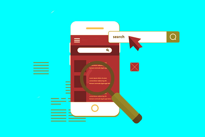
Five Tools To Know If Your Site Is Ready For The Mobile First Index
Did you know the Mobile First Index will be Google’s new algorithm paradigm? No? So could you find out how to prepare for it? An excellent natural referencing strategy involves the following:
- Optimizing web content with targeted keywords.
- Linking.
- Even the technical optimization of pages.
But these are no longer the only determining factors of a good SEO strategy. As we know, Google’s algorithm considers new SEO criteria, such as HTTPS sites and Mobile First. These are two SEO criteria to take into account in 2017 seriously. Google’s future measures go in this direction. The upcoming arrival of the Mobile First Index, which consists of prioritizing mobile pages in the ranking and positioning of sites on Google, should encourage you to adapt your site to mobile quickly. Here are five tools that will help you know if your site is Mobile-Friendly and what points to improve.
Firefox And Chrome Developer Tools
On each of these browsers, you can perform Responsive Web Design tests. From Firefox: in the menu, select “Development” then “Adaptive View.” The site you were on then appears. You can do different tests by choosing a device, the screen size, the orientation, the device pixel ratio (DPR), or even the activation of touch events. From Chrome: on your website, right-click and select “Inspect.” You can then visualize the site according to the desired terminals and sizes.
Also Read: Web Hosting: Entry-Level Tariffs – Perfect For A Small Website And Working With CMS
Resizer.io
The Resizer tool allows you to test the display of your website on different desktop and mobile devices. The icons at the top right also will enable you to test the collection according to the various possible screen sizes and the orientation of the mobile (portrait or landscape).
Mobile Optimization Test Or Mobile-Friendly Test
Google has set up a tool to test whether your site is Mobile-Friendly. Simply enter the site’s URL to analyze here to obtain the test result automatically. We see the rendering of your site on a smartphone, as well as any ergonomic problems related to mobile detected on your website. The tool takes into account:
- Using Flash content
- Display issues (viewports fixed width or not configured for mobile, content size not suitable for viewport)
- Font sizes too small
- Tactile elements too close together
If there are points to correct, the tool redirects you to help sections. If your site is mobile-friendly, you can submit it to Google. This index request feature allows you to ask Google to recrawl your URLs for indexing.
Think With Google My Site Test
The Test My Site tool offered by Google measures in the form of a score out of 100:
- The level of mobile compatibility of your site
- mobile loading speed
- PC loading speed
As with the other tools, simply enter your URL to see the different scores appear. Each result is then detailed according to the good points of the site and the points to be corrected. You can also receive a more detailed report by email.
PageSpeed Insights From Google Developers
In the same way as Test My Site, PageSpeed Insights measures your site’s loading performance on PC and mobile. This tool displays the same results as Test My Site since the latter’s results are generated from PageSpeed Insights. So you’re wondering what the point of PageSpeed Insights is. The tool is a little more complete by offering a link to the steps for solving the problem under each topic, which Test My Site does not provide.
Many other tools give you an overview of your website on different PCs and mobile devices. But to go further in the portable test of your website, Google has developed several exciting tools just to prepare you for the upcoming arrival of the Mobile First Index. Thus, they not only allow you to see if your site is configured for mobiles but also to know the loading speeds, guaranteeing an optimal user experience on mobile. Also, some tools are more comprehensive than others. For example, they specify which points must be corrected to improve mobile compatibility.
Also Read: What Is A Website Mockup, What Is It For, And How To Do It?